

Matching fitness apparel colors means selecting coordinated hues and fabrics that sharpen your workout style and communicate your personal identity before you lift a single weight. Color coordination in fitness wear is not a vanity exercise. Research on capsule wardrobe building confirms that a strategic color palette anchored in versatile neutrals produces more outfit combinations and fewer dead-end pieces. The difference between a gym bag full of mismatched separates and a wardrobe that works together every time comes down to three things: a neutral base, intentional secondary colors, and a disciplined accent pop. Irongentry builds every collection around this principle, from the basics to the fine details.
How to match fitness apparel colors: the core framework
The most reliable system for color coordination in fitness wear is the 60-30-10 rule. Sixty percent of your pieces use a neutral base like black, gray, or navy. Thirty percent feature secondary pairing colors like olive, slate blue, cream, or white. The remaining ten percent are accent pops: teal, coral, burnt orange, or deep purple. This 60-30-10 color rule maximizes outfit combinations because every piece connects to at least two others in your wardrobe.
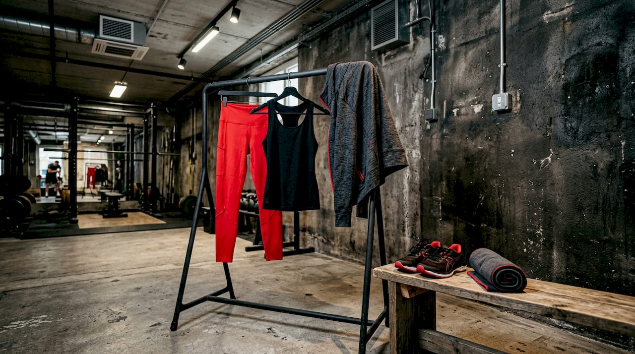
Neutral bases earn their dominant share because they pair with everything. A black compression legging works with a charcoal sports bra, a white tank, an olive hoodie, or a slate blue zip-up without any visual conflict. That versatility is the entire point. When 60% of your gym wardrobe operates this way, you eliminate the frustration of owning pieces that only match one other item.
Secondary colors add personality without creating coordination problems. Olive, cream, and slate blue all sit close enough to neutral on the spectrum that they blend naturally with black or gray bases. They also pair with each other, which doubles your outfit options. The accent color is where you make a statement. One teal sports bra or one coral crop top gives your outfit a focal point without overwhelming the look.
- Neutral base (60%): Black, charcoal, gray, navy, white
- Secondary colors (30%): Olive, cream, slate blue, taupe, burgundy
- Accent pops (10%): Teal, coral, neon yellow, deep purple, burnt orange
Pro Tip: Buy your neutral base pieces in multiples. Two identical black leggings and two gray shorts give you a reliable foundation that never fails to coordinate, no matter what top you grab.
Matching sets vs. mix-and-match: what you need to know
The difference between a true matching set and a coordinated mix-and-match outfit is more technical than most people realize. True matching sets achieve exact color consistency only when made from the same fabric and dye lot. This means the top and bottom were cut from the same bolt of fabric and processed in the same dye bath. The result is a seamless, identical color across both pieces.
When you mix pieces from different brands or even different production runs of the same brand, visible shade differences appear. A “black” legging from one brand and a “black” sports bra from another can look noticeably different under gym lighting because different dyeing vats produce shade variation even within the same nominal color. Different fabrics absorb dye at different rates, so a polyester-spandex blend and a nylon-spandex blend will never produce the same black, even from the same dye formula.
| Approach | Color consistency | Best for | Risk |
|---|---|---|---|
| True matching set | Exact, dye-lot guaranteed | Polished, put-together look | Limited styling flexibility |
| Tonal coordination | Close but not identical | Mixing brands and pieces | Minor shade differences visible |
| Color-blocking | Intentional contrast | Bold, fashion-forward looks | Requires confident color choices |
| Monochromatic | Same hue, varied shades | Sleek, minimal aesthetic | Can look flat without texture |
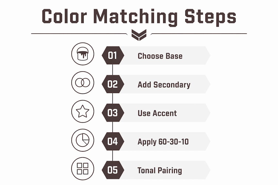
The practical solution for mixing brands is tonal coordination rather than exact matching. Pair a black top with dark gray bottoms instead of chasing the same black. The slight contrast reads as intentional rather than accidental. Nike’s own styling guidance recommends either monochromatic or all-white outfits as the two most reliable approaches for gym wear that always looks put together.
Color-blocking is the other strong option. Pairing a cobalt blue sports bra with rust orange leggings creates a deliberate contrast that reads as styled, not mismatched. The key is choosing colors that sit opposite or at a 120-degree angle on the color wheel. Cobalt and rust, teal and coral, purple and yellow all work. The contrast is the point.
Pro Tip: Stop trying to match exact hex codes across brands. Treat cross-brand coordination as tonal pairing, not color matching. A tonal coordination approach eliminates the frustration of near-misses and makes every outfit look deliberate.
How to build a color-coordinated fitness wardrobe from scratch
Building a capsule fitness wardrobe starts with a single neutral base color decision. Choose black, gray, or navy as your anchor. Every piece you buy in that neutral works with everything else you own. From there, add one or two secondary colors that complement your neutral. If your base is black, olive and slate blue are natural partners. If your base is gray, cream and burgundy work well.
A system-based wardrobe with fixed base, secondary, and accent colors eliminates isolated pieces. An isolated piece is one that only matches one other item in your wardrobe. These are the pieces that sit unused at the bottom of your gym bag. A color system prevents them from entering your wardrobe in the first place.
Here is a practical starter capsule for a black-based wardrobe:
- Base (black): 2 leggings, 2 shorts, 1 zip-up hoodie, 1 sports bra
- Secondary (olive): 1 oversized tee, 1 long-sleeve top, 1 jogger
- Secondary (slate blue): 1 sports bra, 1 tank top
- Accent (coral): 1 sports bra or crop top
Every item in this list pairs with at least three other items. The olive tee works over the black leggings, the slate blue sports bra, or the black sports bra. The coral accent pops against the black base and the olive secondary. You get more than 20 outfit combinations from 13 pieces.
Fabric quality matters for color longevity. Rich, saturated colors hold better in high-quality fabrics because the dye penetrates more evenly and resists fading through repeated washing. Cheap polyester blends tend to fade unevenly, which destroys color coordination faster than anything else. Investing in quality pieces from brands that prioritize fabric construction protects your color system over time.
Styling tips for coordinating gym outfits by workout type
Color selection for gym wear works best when it matches the energy of your workout. Bright neon colors energize high-intensity sessions while soft, natural tones suit calm, low-impact activities. Neon green, neon pink, and neon yellow are the dominant choices for HIIT, cardio, and strength training in 2026. Earth tones like olive, beige, and warm taupe are the preferred palette for yoga and Pilates.
This is not arbitrary. Color psychology research consistently shows that high-contrast, saturated colors increase perceived energy and alertness. Wearing neon yellow to a spin class is not just a style choice. It actively reinforces the high-energy mindset the workout demands. Conversely, wearing muted sage green to a yoga session supports the calm, focused state that practice requires.
Monochromatic and color-blocking approaches are both effective tools depending on your goal. Monochromatic looks, where you wear varying shades of one color, create a sleek, intentional appearance that photographs well and reads as polished in any gym setting. Color-blocking creates visual energy and works especially well for group fitness classes where you want to stand out.
Common mistakes to avoid when coordinating fitness apparel color combos:
- Chasing exact matches across brands. Dye-lot variation makes this nearly impossible and the near-miss looks worse than an intentional contrast.
- Buying accent pieces without a base. An accent color only works when you have a neutral base to anchor it. Buying three coral pieces and two teal pieces without a black or gray foundation creates a wardrobe with no connective tissue.
- Ignoring fabric texture. Two pieces in the same color but different textures (matte vs. shiny) can clash visually even when the hue is identical. Match texture families as well as colors.
- Neglecting layering. A neutral zip-up or hoodie over a bold accent piece ties the whole outfit together and adds a third coordination layer without complicating the look.
Pro Tip: When shopping for new pieces, photograph your current wardrobe and bring the photos with you. Comparing a new piece against your actual wardrobe in-store prevents the “it looked fine in the store” problem that creates isolated pieces.
Key takeaways
Matching fitness apparel colors works best when you build from a neutral base, add limited secondary colors, and use accent pops strategically rather than chasing exact shade matches across brands.
| Point | Details |
|---|---|
| Use the 60-30-10 rule | Sixty percent neutral base, thirty percent secondary, ten percent accent maximizes outfit combinations. |
| True matching sets require same dye lot | Exact color consistency across pieces only holds when fabric and dye bath are identical. |
| Tonal coordination beats exact matching | Pairing black with dark gray reads as intentional; chasing the same black across brands rarely works. |
| Match color intensity to workout type | Neon and bright colors suit high-intensity training; earth tones and muted hues work for yoga and Pilates. |
| Build a system, not a collection | A fixed base, secondary, and accent palette eliminates isolated pieces and multiplies outfit options. |
Why I stopped trying to match everything perfectly
The biggest shift in how I think about fitness apparel color coordination came when I stopped treating it as a precision exercise. For a long time, I bought pieces trying to find the exact same black across every brand. The result was a drawer full of near-misses that looked worse together than pieces I had intentionally contrasted.
The moment I switched to tonal coordination, everything clicked. A deep charcoal legging with a true black sports bra does not look like a mistake. It looks like a choice. That mental reframe changed how I shop and how I dress for every workout.
What I have found actually works is building the wardrobe as a system before buying individual pieces. Decide on your base color first. Then decide on one or two secondaries. Then, and only then, pick your accent. Every purchase after that is evaluated against the system, not against a vague sense of whether something “goes.” This approach also makes it easier to invest in quality. When you know a piece fits your color system, you can justify spending more on better fabric, which protects your colors through hundreds of washes.
The style and the function are not in competition. A well-coordinated outfit that holds its color and fits your body well is also a functional outfit. Irongentry’s approach to design, from the basics to the fine details, reflects exactly this. Statement-making does not require complexity. It requires intention.
— zack
Build your coordinated gym wardrobe with Irongentry
Knowing the rules for color coordination is one thing. Having the right pieces to execute them is another.
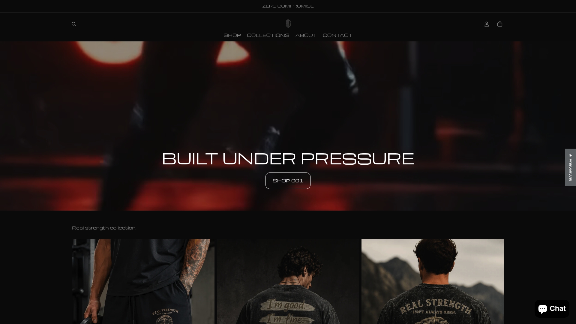
Irongentry designs activewear built around the principle that every detail matters, from fabric quality to color saturation to how pieces coordinate across the collection. Whether you are starting with a neutral base or adding a statement accent, the Irongentry collection gives you pieces that work together by design, not by accident. Browse the full range at Irongentry and build a gym wardrobe that makes a statement every time you walk through the door.
FAQ
What is the best color rule for matching gym outfits?
The 60-30-10 rule is the most reliable framework: 60% neutral base colors like black or gray, 30% secondary colors like olive or slate blue, and 10% accent pops like teal or coral. This system maximizes outfit combinations and eliminates pieces that only match one other item.
Why do matching sets look better than mixed pieces?
True matching sets are dye-matched from the same production batch, which guarantees identical color across pieces. Mixed pieces from different brands show visible shade differences due to dye-lot variation, even in the same nominal color like black.
What are the best colors for workout clothes in 2026?
Neon green, neon pink, and neon yellow lead for high-intensity training, while olive, beige, and warm taupe dominate yoga and Pilates wear. Classic neutrals like black, gray, and navy remain the most versatile base colors across all workout types.
Can you mix brands and still have a coordinated gym outfit?
Yes, by using tonal coordination instead of exact color matching. Pair a black top with dark gray bottoms rather than trying to match the same black across brands. Intentional contrast reads as styled; near-identical shades that do not quite match read as a mistake.
How do I avoid buying gym clothes that do not match anything?
Build a color system before you shop. Fix your neutral base, choose one or two secondary colors, and select one accent color. Evaluate every new purchase against that system. A fixed color palette prevents isolated pieces that only pair with one other item in your wardrobe.
0 comments